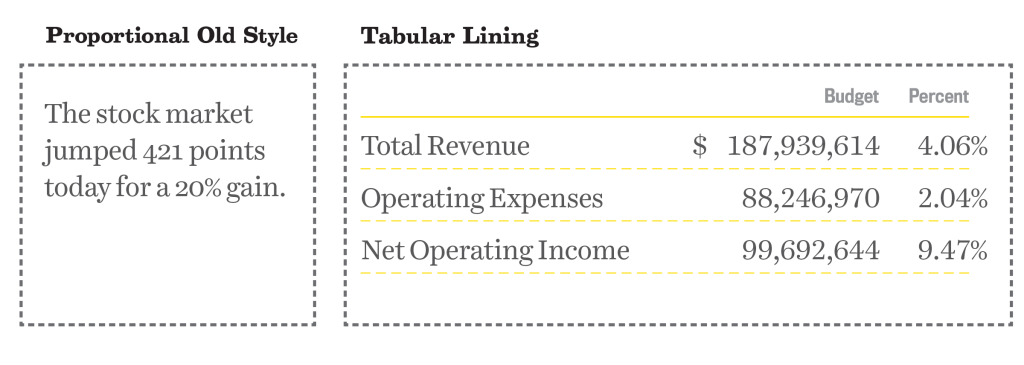
Did you know that there are two ways to set numerals? You know uppercase and lowercase letters exist, but did you know there are also ‘uppercase’ and ‘lowercase’ figures? In addition to lining and old-style, there’s also two different spacing formats, proportional and tabular.
So much to know about figures, so here’s how it breaks down.
Differences in Height
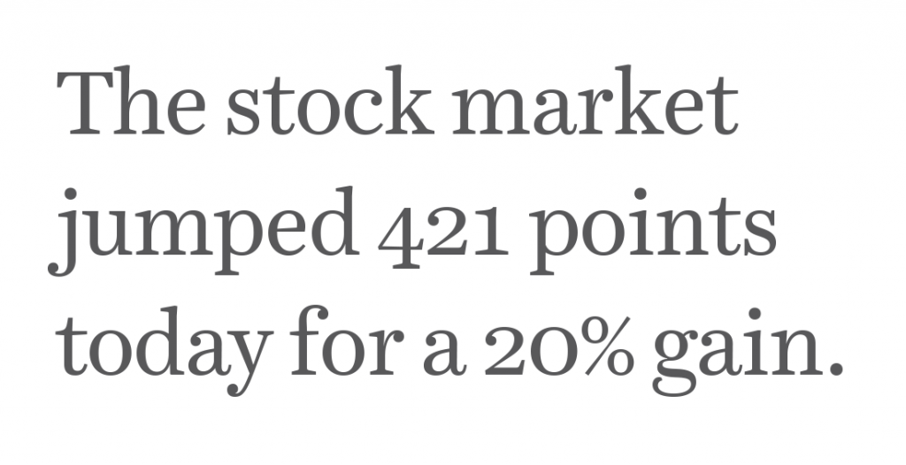
Old Style numerals (otherwise known as text or lowercase figures) have varied heights in a fashion that resembles a typical line of running text. They follow the ascenders and descenders of lowercase letters. If you set body copy, use old style figures for dates, phone numbers and other uses. Whenever sentence case is used, set your figures in old style. It might look weird because you’re not used to it, but it follows the way people read.

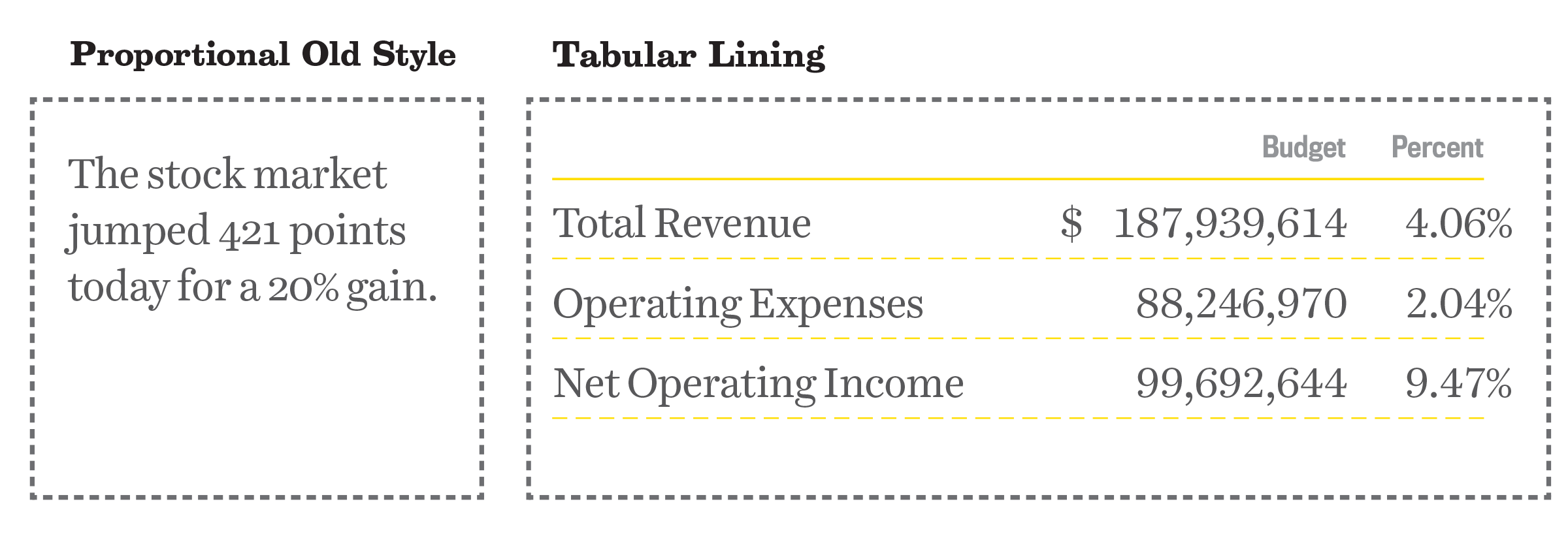
Using lining numerals (otherwise known as titling or uppercase figures) in body copy disrupts the flow of reading, in the same way that ALL CAPS SHOUT to your reader. Lining numerals work best next to all-cap height letters, or more commonly, in financials for accounting applications. Having all the figures line up at the cap-height makes them easy to read in a line.
Differences in Width
Proportional figures have variable spacing, which results in even color on the page created by horizontal rhythm and reading. The spacing around each figure allow for the width of each figure. Not only do I recommend old style numerals for body copy, I will also recommend them to be proportional. In order to implement, look for “proportional old style” numerals.

By contrast, tabular figures have uniform spacing and have the same width. These numerals act more like monospaced glyphs, so where no matter what the actual width of the character is, the space in the glyph will be the same. Tabular figures are perfect for financials, price lists and setting math, because they will be aligned vertically when set into columns. For accounting applications, be sure to choose “tabular lining” numerals.
Why it Matters
When choosing a typeface, not only are glyphs important to the usage, but so are the numbers. Figure height and width spacing matters. If you’re setting long-form reading content, choose a typeface that has proportional old style figures. If setting financial-heavy documents, choose a typeface that has tabular lining figures. Choosing the right typeface for your project will help you design a great reading experience.
I explain more about numerals, letters and glyphs and all you need to know about choosing the perfect typeface in our online typography basics class, Type 1. Does your favorite typeface have old-style or lining numerals as a default? Let me know by tweeting us at @TypeEd. I’d love to see what type of numerals you’re using.
Michael Stinson is a co-founder and instructor at TypeEd, where he helps designers implement better typography, efficiently. Get more typography in your inbox when you sign up for more updates about TypeEd.


