Most people work with inches when designing their pages. Makes sense, right? We are used to working with inches when we start designing because that’s the physical measurement unit of the format, and where we typically start: the size of the flyer, brochure, box, etc.
But when we stay in inches, the type is not in harmony with the page. To rectify, we need to use the correct unit of measurement.
Our type is measured in points. For example, 9 – 12 point size for body copy is typical. So how do we build visual uniformity from the page to the type? Easy. Picas.
I think I just heard you groan out loud. Yeah, yeah, I hear you, designers don’t like math. Well guess what, this isn’t rocket science, it’s simple division. The units are so small using picas are easier than using inches because there’s little need for fractions and decimals.

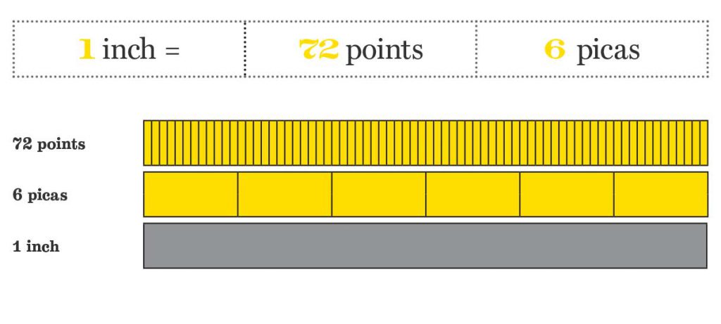
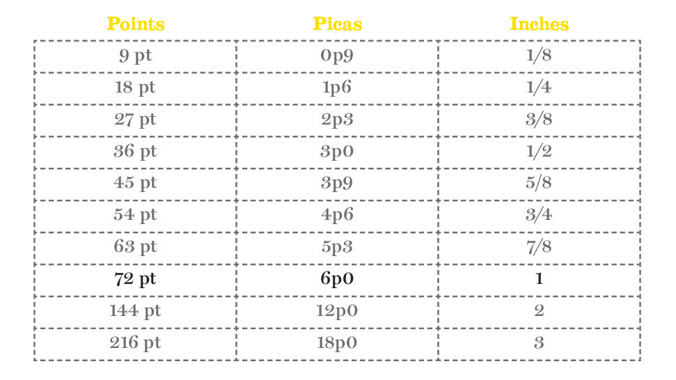
A pica is a unit of space that connects points to inches. There are 6 picas to an inch. See? Sooooo simple. It is a term from the 1580s, probably from pica, a name of a book of rules in the Church of England for determining holy days. I know, a little random.
A point is the unit we use to measure overall type size, and there are 12 of them in a pica. So, if there are 12 points in a pica and 6 picas to an inch, there is 72 points to an inch. That means, depending on the typeface, a header that’s 72-point type size, could be possibly an inch high. Easy, right?

Next time you open up a fresh Adobe InDesign document, don’t immediately switch your measurement system to inches (um yes, points and picas are the default!).
Instead, try typing in your format size in an inch measurement (for example: 8 in), and InDesign will convert it automatically for you. Thanks, Adobe. Picas and points are the measurement system of the environment you’re working in for print. It’s not inches. It’s not pixels. It’s points and picas.
I use points and picas to create a visual relationship from the page to the type. It’s that intimate relationship that creates great looking copy on the page. Columns, alleys, gutters, margins; they all look better if set in a relative measure to the type size.
Develop a fondness with points and picas. Love them and they’ll love you back.
Do you use picas or inches? Tweet us at @TypeEd and let us know your preference.
Michael Stinson is a co-founder and instructor at TypeEd, where he helps designers implement better typography, efficiently. Get more typography in your inbox when you sign up for more updates about TypeEd.


