We all have body issues, well, at least I do. Sometimes it’s bloated and every so often, it feels too wide or tall. On occasion, I don’t feel comfortable with it, or it just isn’t appealing enough for readers to get to know better.
Are you working hard in one area but not making overall progress on your page?
Pages of copy will not be paid attention to unless the type looks irresistible. But I’ve found a way to have readable sections, svelte rags and desirable line lengths that just feel so… right.
Here are seven ways to make your readers beg for more (information).
1. Read it first, or at least scan it.
Review and take notes on the content types. Then be sure the typeface you choose contains the weights, special characters, and glyphs found in the draft copy. You don’t want to be typesetting for two days in and realize the font you’re using doesn’t support the fractions on page 24.
2. Keep it simple.
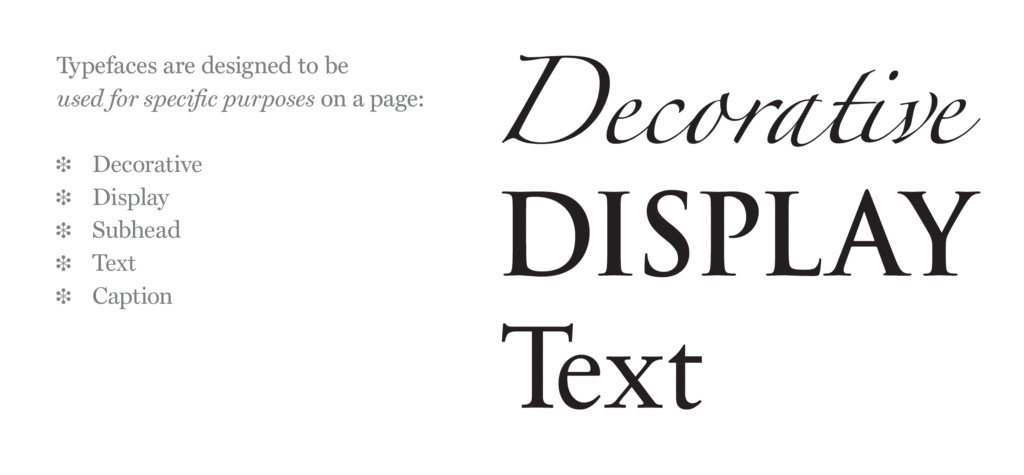
Avoid using display fonts for body copy. Display fonts have a lot of personality, and that personality gets in the way of the reading experience. Leave the personality to the cover type, headers and subheads. For run-in subheads, body copy and smaller type, stay legible and readable with roman typefaces.

3. Contrast communicates context.
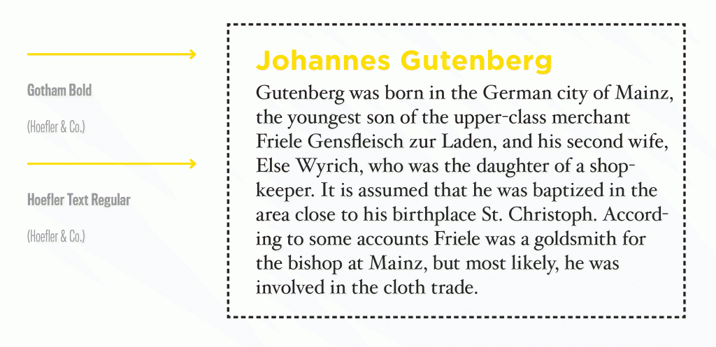
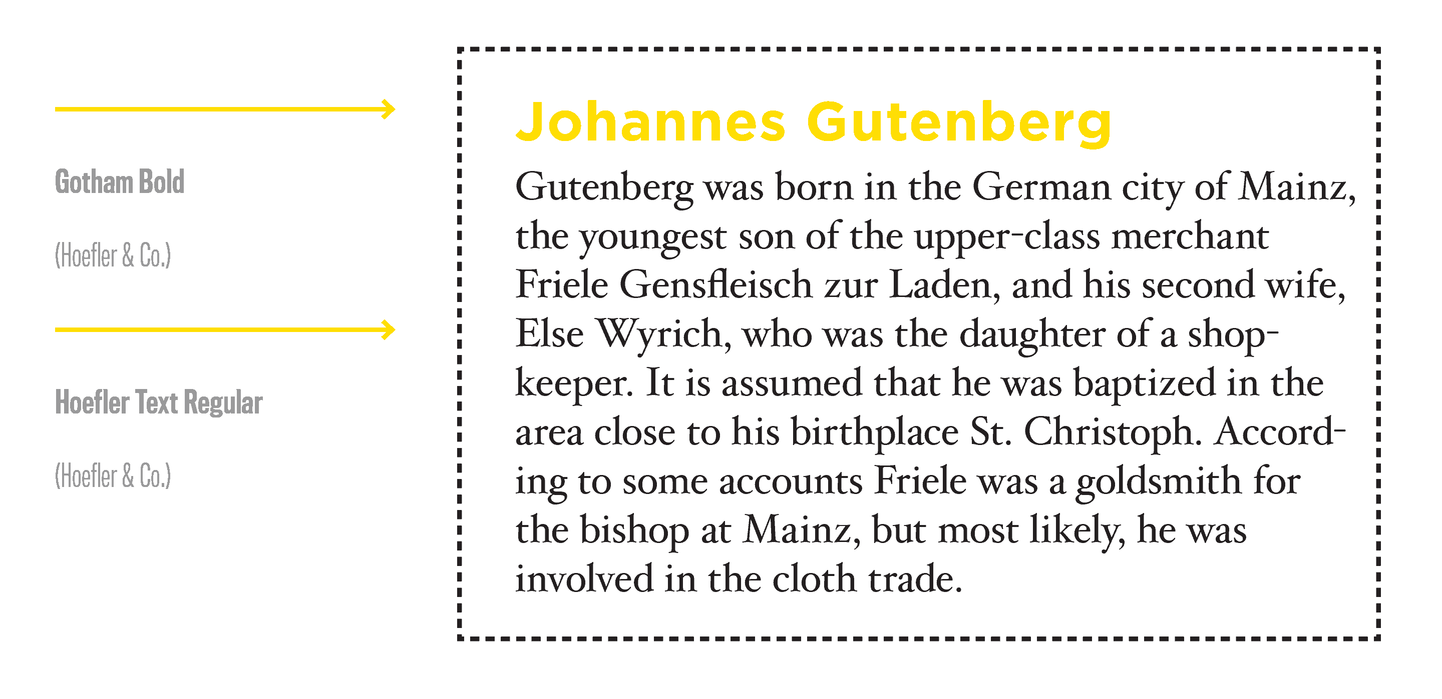
When pairing, choose faces from different classifications. When typefaces are too similar, they play tricks on your readers eyes. The body copy might be Helvetica but if the subheads are Arial, they might be difficult to identify. To play it safe, choose a serif and sans serif.

4. Less is more.
An elegant typography system can be created with different weights from the same family. You don’t need more than two typefaces to create beautiful body copy. And in many cases, it can be done with just one if the typeface has many fonts. Many families have gorgeous italics or small cap fonts to help you create variety while maintaining consistency.
5. Maintain consistency.
Establish a system early in the project to ensure the same fonts and guidelines for usages are adapted among your team. Cement the system designated with headers, subheads, body copy, captions and legal into a style guide and utilize across all media for a persistent look to all brand communications.
6. Keep your lines comfy.
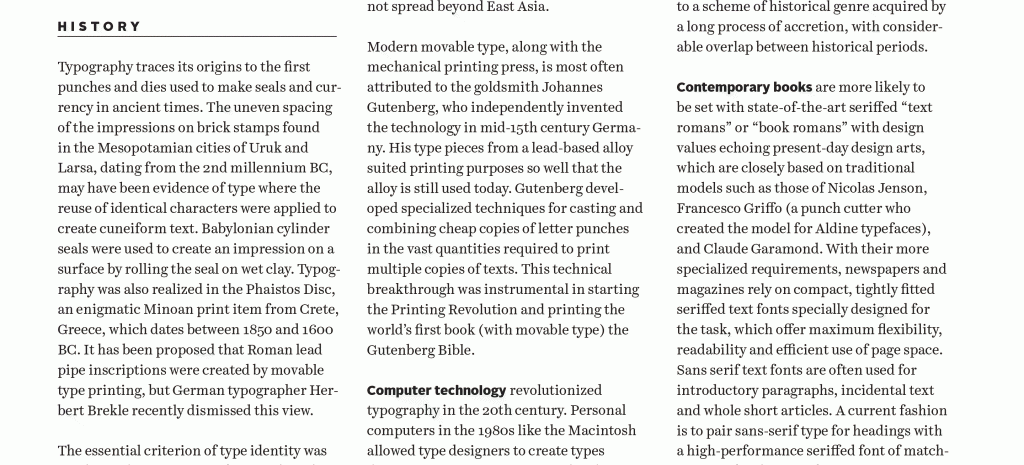
Readers’ eyes can only scan so much at one time, typically 50-70 characters per line, so keep your line lengths short. When lines are too long, it’s difficult to find where to begin reading the next sentence and continue. When lines are too short (less than ten words), your copy block will lack elegant rhythm and proportion. Try to either adjust the font size or create two columns to create a comfortable line length.

7. Create body shape.
Left justified type is lovely, and even more so when the rags are shapely. To create beautiful, curvy rags at the right edge of all of your paragraphs, use hyphens. Avoid leaving a hyphen on the first line, and don’t allow three hyphens in a row (the term for three in a row is called pigtails), because it’s difficult to locate the next line. Keep to three or four hyphens per paragraph, if possible.

Incorporate these tips as part of your copy setting process, and then stand up and be proud of your body! Your page layouts will invite the reader in and they will love your new body copy.
To gather inspiration on how others create hierarchy and set body copy well, we refer to the printed versions of Worth , Fast Company , New Beauty, McSweeney’s Quarterly and more. If you’re looking for really clean blocks of copy, download a few Mercedes brochures. Nothing like a little German engineering in the typesetting to inspire us all.
For those who are really into refining your body copy, read more about Michael Stinson’s secret to setting a perfect block.
Do you have any favorite magazines or books that draw you in with their body copy and keep you reading? Let me know by tweeting us at @TypeEd. I’d love to see what inspires your design work.
Rachel Elnar is the producer and co-founder at TypeEd, where she helps bring the craft of typography back to design education. Get more type in your inbox and sign up for more about TypeEd columns (and other announcements).


