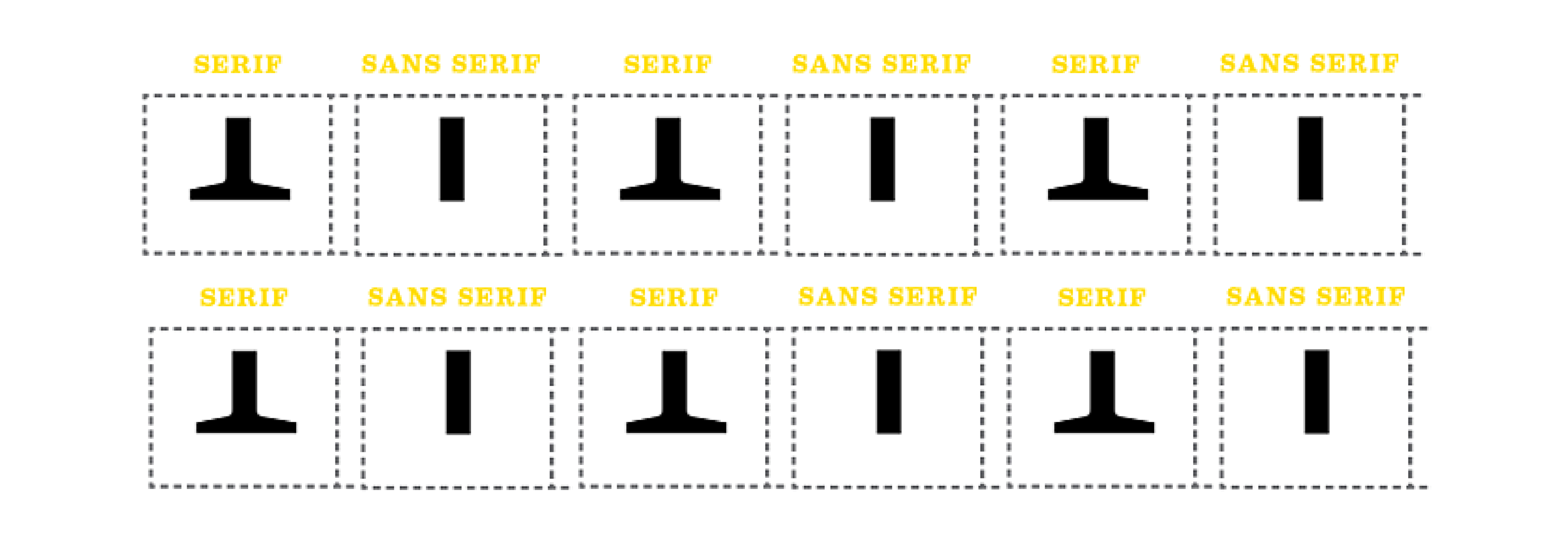
Since the dawn of time, ah-hem, actually since the 18th century, there’s been a clash of preference around serif vs. sans serif letterforms. What’s up with the typeface tussle? Is there really a difference? Well, some people love serifs, some people hate them.
What are serifs? They are the small feet at the end of the strokes on a letter or symbol. Some typefaces are serifed, and others are unserifed, otherwise known as sans serif.

Which side do you fight for in the ultimate typeface choice for your needs? Well, that depends.
Rivalry for readability!
There’s been 100 years of research and argument on which style is more readable. This is the general thought in the typography community about serifs:
“Serifs are used to guide the horizontal “flow” of the eyes; The lack of serifs is said to contribute to a vertical stress in sans serifs, which is supposed to compete with the horizontal flow of reading.” [De Lange, R. W., Esterhuizen, H. L., Beatty, D. (1993), Electronic Publishing]
This has not been fully proven. There are a few factors in favor of serifs though, serifs have additional indication to their characters that sans serifs do not, thereby improving identification. And, readability also is increased if typeset well.
What the sans serif team has going for it, is the fact that sans serifs are much more easy to read when set small. Those pesky serifs tend to clog up negative spaces when scaled down. It’s been claimed that sans serifs are easier to read on screen.
I’m not sold on that, but I agree with that statement pre-2010 before hi-resolution and retina screens came into play on our devices. Those serifs used to crumble against the harsh light of the LCD monitor screen.
The tried-and-true application was always serif for reading copy, sans serif for emphasis.
Spar for medium!
Determining the final output of your piece will help you advance towards the best choice. Besides the differences in color spaces CMYK vs. RGB, the way we perceive light is totally different between paper and screen. Light reflects off paper to read, whereas on a screen, the surface is backlit (which can cause a degree of fatigue).
We used to assume that we could make any ol’ serif and sans serif fonts play nicely. But that was 10 years ago, but now we have to know if they were designed for print or for screen. Screen fonts don’t have print features like ink traps.
And same goes with the screen. Many digital versions of classic fonts have been re-engineered for the screen. Just make sure you source recent versions that work best with the software. Needing to set really small type? Choose Reading Edge fonts, which were developed for reading at small sizes on the screen.
If you’re going to press with your piece, think about how many printing plates you’re specifying, and what paper you’ll be printing on. This consideration will also affect the final output.
If you are printing on textured paper or reversing out your type, you’ll have to increase the type size or weight, or choose a typeface that can hold the ink. Consult with your print rep to make sure. If you’re planning on staring on the big screen (or small screen), consider these three things: how far from someone’s eyes your type will be seen, what the final screen resolution is and environment your design will be viewed.
Clash for context!
Read the content before you set it, and decide which works best to translate the tone.
Serif typefaces are the elder of the two styles; the first letterforms created were serifs, and sans serifs are relatively new on the scene (18th century). So, if you want to demonstrate a bit of history or authority, serifs are your weapon of choice.
If you’d like something more contemporary, choose a sans serif. Sans serifs are typically informal, and serifs formal, but from there, there’s no rules. Once you decide, start digging into your classifications to narrow it down and really make decisions based on the nuances of letterform anatomy.
So which one is the best?
As you see, there’s a bunch of qualities to consider just in the first step of choosing between serif and sans serif. There’s no one single answer. But no matter which you choose, a successful choice will be evidenced by the message understood first when reading, not the style of the font.
Once you make that choice, you’ll need to dive into classifications. We love the book The Anatomy of Type, A Graphic Guide to 100 Typefaces by Stephen Coles. The book demonstrates the characteristics between classifications to help you choose wisely.
Back in the phototypesetting years, there was hundreds of fonts to choose from. Nowadays, picking out a typeface is much more difficult as there are over 300,000 fonts available for direct download. Ay caramba.
Know what you’re designing and then you can make your choice more swiftly. In our online Type 1 Class, I provide an ESPN-highlight view of classifications, which I dive deeper into this topic. Do you typically prefer serif or sans serif fonts? Let us know on Twitter at @TypeEd.
Michael Stinson is a co-founder and instructor at TypeEd, where he helps designers implement better typography, efficiently. Get more typography in your inbox when you sign up for more updates about TypeEd.


